Why I’m Excited to Teach this Course
Python is powerful. There’s a reason why data giants like YouTube, Dropbox, Survey Monkey, and Quora use it. But it’s for far more than just managing user data on the backend. Python has a wealth of libraries and frameworks that can help leverage the information that data-heavy organizations already have, for better business decisions and sharing information across the company.
Python developers who are able to analyze and display data in a way that anyone can understand are solid assets to their team, and have a leg up on other developers in the market. I’m excited to teach other Pythonistas such a valuable skill set—for both them and their companies.
Why Data Visualization Helps
Large tables of numbers and data points don’t present much meaning to anyone. Shareable figures that are custom-built for a company’s needs are easily worth 1,000 words (or better yet, 1,000 interlinked excel spreadsheets). Developers who can take that data, mine it for what matters—and exclude what doesn’t—and display it in a user-friendly, digestible way are invaluable to their company.
It’s crucial for modern companies to have clean, easy-to-understand data to inform business direction and measure outcomes. Well-structured visualizations make company data more accessible to staff across the board.
Why Use Python for Data Visualization
There are several reasons to use Python for data visualizations.
- It’s open source
- It has available packages designed for quick, efficient mathematical operations
- It has an active development community that keeps resources robust and well documented, especially among the data visualization crowd
- It offers accessible tools for junior and mid-level devs who have the necessary math skills
- Because Python offers a lot of power to its developers, it can easily become a low-cost alternative to other data visualization tools
- By creating their own charts and output with Python, developers can write very flexible code and can fully customize visualizations as needed
What Students Will Build
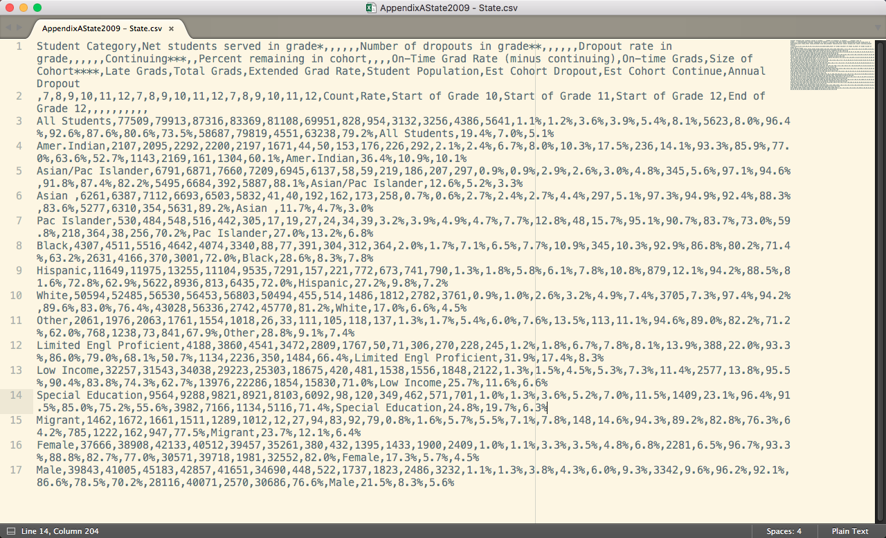
Students will take something that looks like this:
And turn it into this:
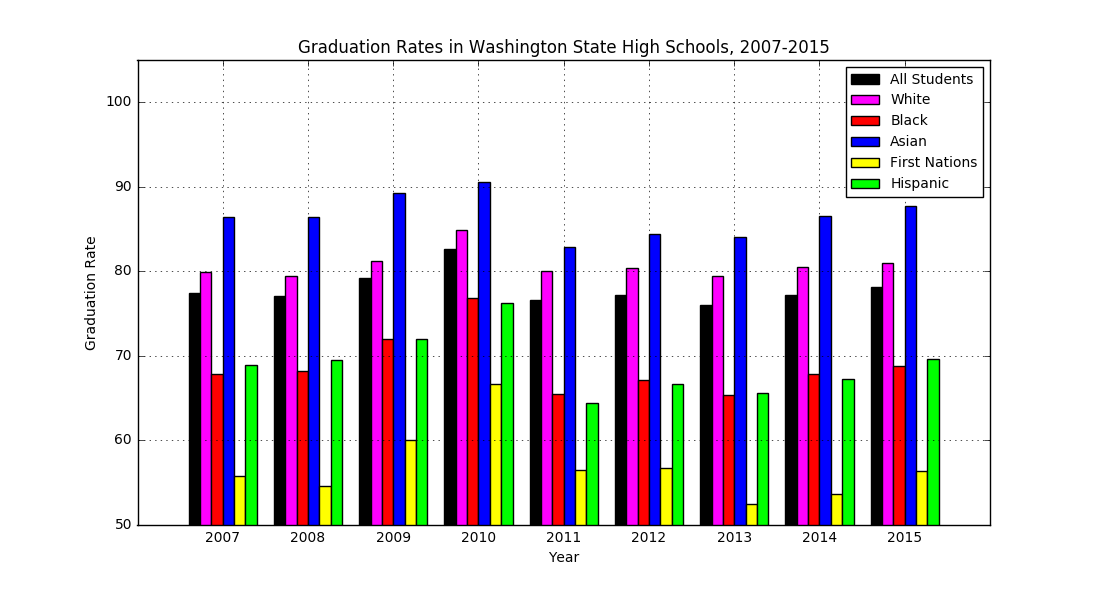
Better still, you’ll learn how to make several different kinds of charts from the supplied data to create unique visualizations ready to add to your portfolio.
In one week, we’ll cover how to use aspects of standard packages for the organization, analysis, and visualization of data, such as NumPy, Pandas, Matplotlib, and Scikit-Learn. You’ll get to apply these skills on a daily basis and, at the end, produce a substantial project showcasing your new abilities as a data analyst.
Interested in enrolling you or members of your dev team? Take this survey to get more information and let us know what works best for you.