It happens to the best of us.
You’re standing in a store, product in front of you, and you wonder what users are saying about it. You pull out your smartphone and do a quick search for the brand.
The site has great functionality and engaging features — for a desktop. You try to check tiny boxes and navigate little menus on your 3-inch screen, cursing your thumbs for not being more nimble and promising yourself that any site you build will be responsive for smartphones.
There is a linear relationship between the number of smartphone users and the need for responsive websites. But creating a website or application that looks good and works well on a desktop, tablet, and smartphone is tricky. Think the solution is to simply create two separate sites with optimized CSS for mobile and desktop users? Think again.
3 problems with using different code bases for different devices
Problem #1: User-Agent Redirects
User-agent redirects detect the user's device and redirects from a desktop URL to one that displays and functions correctly on a mobile device, usually a subdomain at m.example.com.
**Problem #2: Two Code Bases**
Two. Code. Bases. Assuming that isn't enough reason right there to abandon this duplicate-site notion, consider the additional work and coordination to update both codes.
**Problem #3: URL Sharing Between Devices**
A user is so impressed with your site or product that they share it on their social network from their phone. Sweet!
But half of their connections click the link and view it on a desktop, and the URL leads them to the mobile version of the site, which ends up looking narrow and broken on their 17-inch MacBook Pro. They're left unimpressed (and even a little put-off) and you're left with potential customers thinking your site isn't user-friendly.
Damn.
**What about tablets?**
Tablets (and the awkward middle-ground phablets — pick a side, already!) bring yet another size and user experience to consider. Some tablets come with cases that have built-in keyboards, which means they can function like a laptop. But users still want the option to use the touch screen and don't bother with keyboard add-ons.
What’s a developer to do?
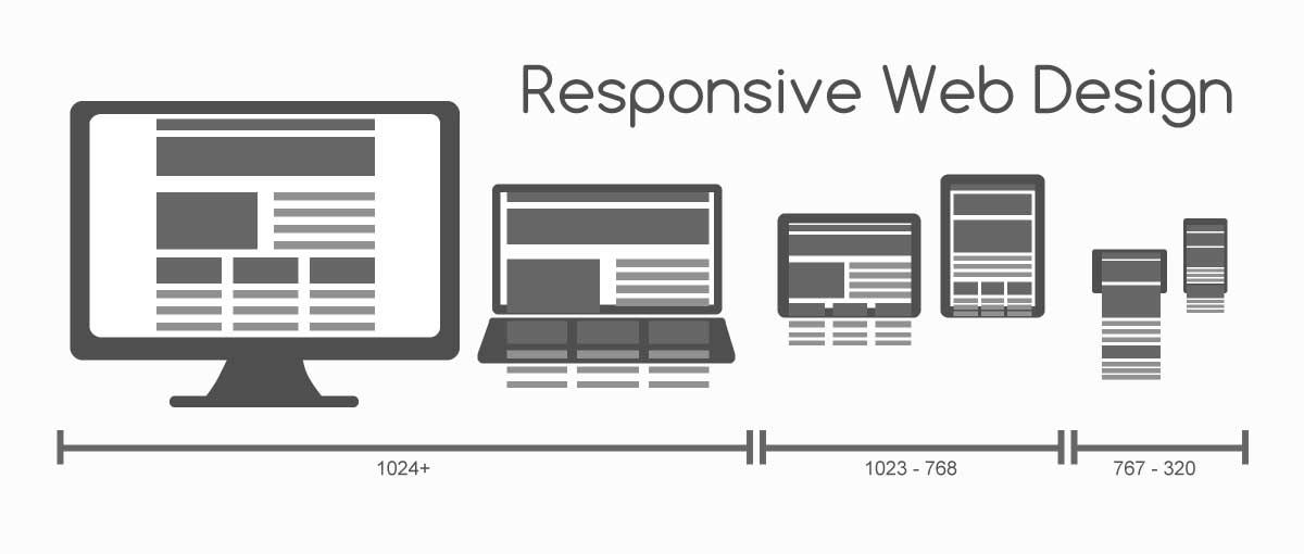
Responsive Web Design
Responsive Web Design (RWD) conditionally modifies the layout of a webpage depending on the width of the device it's being viewed on.
Simple.
Mozilla’s resource for web developers puts it oh so nicely:
Media queries, added in deprecated CSS3, let the presentation of content be tailored to a specific range of output devices without having to change the content itself.
In other words, you modify the CSS based on the browser’s:
-
Width / Height
-
Orientation
-
Media Type (Screen, TV, Braille, etc.)
-
Color
-
Resolution
-
Aspect-Ratio
Our website is responsive — resizing the browser changes the layout of the text and images.
Using RWD on your website
Applying a grid layout to your website allows it to easily transition from phone to tablet to desktop displays, depending on the user's device.

Mobile-tuned JavaScript enhances the user’s experience. Touch-optimized menus, for example, are beautifully simple and easy to use on a smartphone when implemented correctly.
Smart responsive web design is like the stage crew at a theater production — everything is going right when you don’t notice it at all.
So you want to build a responsive website
Where do you go from here? There are some options for transitioning your website to a responsive layout, if you’re ambitious and want to get started with RWD:
- Foundation
This open source product by Zurb is a responsive front-end framework that offers several different HTML templates to choose from. - Skeleton
This boilerplate for developing mobile-friendly websites gives you a foundation for your website. The bonus for Skeleton is its simple syntax and basic provision of basic styles, which means the look of your site is entirely up to you. - HTML and CSS: design and build websites by Jon Duckett
If you want to skip the templates and create your own responsive website from scratch, Ch. 15: Layouts offers great instruction on grid layouts. This is also a great place to go if you’re just getting started in web development.
Try it out—Your mobile visitors will sing your praises (or just appreciate how easy your website is to use on a smartphone. Win-win!).
