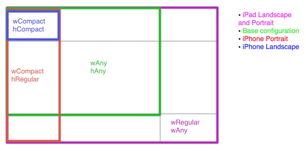
Size classes also enable the condensing of universal apps into one storyboard file. Combined with the new adaptive view controllers, it’s easier than ever to rely on interface builder, rather than fight with it, to simplify the creation of your app layouts.
Every view controller in your app gets a trait collection object. This trait collection object has two size classes: a horizontal size class and a vertical size class. Each of these classes has three possible values: compact, regular, or any. These values can change, based on the device and its orientation. Your app will lay out its interface for each view controller, based on the current size classes. Apple uses a grid to let the user choose which configuration to work in, so here’s that same grid, but with each device+orientation highlighted in its corresponding size class combo:

Here’s one interesting thing to note: iPad has Regular x Regular for both landscape and portrait. Straight from Apple’s “What’s new in iOS8 guide”:
With the amount of screen space available, the iPad has a regular size class in the vertical and horizontal directions in both portrait and landscape orientations. —Dr. Dre*
Ok, enough by-the-books stuff. Let’s open up Xcode 6 and try it out for ourselves. Due to Apple’s NDA on Xcode 6 screenshots, the screenshots provided below are actually from Xcode 5, so keep in mind that my images are a general guide of what screen to be on.
Create a new universal project for this demo. If you want to try it out in an existing Xcode 6 project, then you might have to explicitly enable size classes. You can do this in Interface Builder in the file inspector, right below the “enable autolayout” checkmark.
First, let’s look at the size class grid in Xcode. This is the area where you can switch your storyboard between the different layout combinations. While viewing your storyboard, look towards the bottom and click on the label that says “wAny hAny.” You will see something that looks like the grid from the top of this post.
By default, we start in our base configuration of any width and any height. Think of this as your master interface. Things set up and changed here will be used by both the iPhone and iPad layout by default for all orientations. Apple recommends doing most of the interface work in this configuration, simply because it would mean less work for you. Let’s lay out a super-wide button in the center of the screen to play with. Give it a green background color so that we can see its true size, and center it vertically and horizontally with constraints:

Give it a ridiculous fixed width of 600:

Now, run the app in both iPad and iPhone simulators. You will see it centered on both, but it’s clearly too wide for iPhone in both orientations. Let’s use size classes to fix that. Go back to the grid and select the iPhone portrait config: compact width + regular height. That’s the red rectangle from the grid:

You will notice that the bar you click on to access the grid changed from white to blue. This is basically just warning you, “Hey you’re not in the base configuration anymore! Some changes you make here will only show when your app is running with these specific size classes. So now this bar is blue!” I say some changes because there are four specific things that you can change between size classes in interface builder: 1) constraint constants, 2) fonts, 3) turning constraints on/off, and 4) turning subviews on/off.
The first two are pretty self-explanatory, but let me show you how the last two work. Let’s try turning a constraint off for the current size class we are in (compact width and regular height). In the document outline, click on the Center X Alignment constraint that we set up on our button:

Now, look in the attributes inspector. Towards the bottom you will see the word installed with a checkmark next to it, and then a plus sign to the left of that. Click the plus sign and click “Compact Width | Regular Height (current).” You will now see two check-marked items. Uncheck the one we just added (wC hR).
Our constraint is no longer installed nor doing anything for this configuration of size classes. As you can see, Xcode is complaining that our constraints are too ambiguous, and if you run the app on an iPhone sim the button is no longer centered on the X-axis. But running it on the iPad shows it still centered, because that constraint is still installed on our base configuration. It will be installed on every configuration except the one that we just unchecked. You can even rotate your iPhone sim and the button will magically go back to being centered, since iPhone landscape is a different size class config. Okay, lets put the checkmark back in so that the button goes back to being centered.
Now, let’s change the constant we set for the button width. Select the button itself, and go to the Size Inspector and scroll to all of the constraints at the bottom. Click Width Equals, and set it to 100.
Run the app on the iPhone sim now, and you will see that the button has the correct width for portrait iPhone. Running on the iPad sim shows the button 600 wide, since we didn’t change the width on our base config. However, it still doesn’t look good on iPhone landscape, because iPhone landscape is still pulling from our base Any x Any configuration. Let’s fix that. In the grid, select “compact width and compact height.” That’s the blue rectangle in our grid:

Now, we’ll change the width constant for this configuration the same way that we did for Compact x Regular. Give it a width of 400. Running the app in iPhone and rotating to landscape causes the button to take a 400 width, which looks great (for our learning purposes). What’s nice is that you can see a list of all the constants for each constraint for each different configuration. Just select the constraint that you want to look at in the document outline, then go to its attribute inspector—they are all listed neatly below the original constant. It labels each one based on which configuration it applied on.
What if we decided that we wanted the button to disappear only when the iPhone was in landscape mode? With size classes, we can uninstall views just like we uninstalled a constraint. Select our UIButton, scroll down to the very bottom of our attributes inspector, and add a new installed option for our current configuration by hitting the plus button, and then by unchecking it.
As you can see, the view instantly disappears from the storyboard because we uninstalled it on the configuration that we are currently looking at. When running the app, you can see that it has gone in portrait iPhone, but it comes back when you rotate to landscape. And it will still be installed on the iPad, since our iPad still uses the base configuration.
The last thing that I want to show you is how we can be notified in code when these configurations are changed by something (usually a rotation). Size classes are meant to replace the use of UIInterfaceOrientation & UIUserInterfaceIdiom, so it’s important to understand how to work with them in your code. The first thing you will need to do is set your view controller(s) to conform to the UITraitEnviroment protocol:
class ViewController: UIViewController, UITraitEnvironment {

override func viewDidLoad(){
    //code
    }
}
This protocol has a required method that notifies your view controller when the trait collection has changed:
override func traitCollectionDidChange(previousTraitCollection: UITraitCollection!) {
    if previousTraitCollection? {
        //print out the previousTrait's info
    println(previousTraitCollection)
    }
}
A UITraitCollection provides details about the attributes of a view controller. Printing them out shows:
<UITraitCollection: 0xb4072a0;
    _UITraitNameUserInterfaceIdiom = 0,
    _UITraitNameDisplayScale = 2.000000,
    _UITraitNameTouchLevel = 0,
    _UITraitNameInteractionModel = 1,
    _UITraitNameHorizontalSizeClass = 1,
    _UITraitNameVerticalSizeClass = 2>
Those last two describe the vertical and horizontal size class of the trait collection that we just changed from. Here’s how that enum looks:
case Unspecified
    case Compact
    case Regular
}
Hopefully, this has helped you get a basic understanding of size classes and how they can greatly simplify your work in interface builder. As always, we’ve uploaded the code from this tutorial to Github.
*probably not Dr. Dre
Ready to become a professional iOS developer? Learn more about getting trained in Swift and Objective-C »

